Definition
‘To communicate information clearly and efficiently, data visualization uses statistical graphics, plots, information graphics and other tools. Numerical data may be encoded using dots, lines, or bars, to visually communicate a quantitative message.[2] Effective visualization helps users analyze and reason about data and evidence. It makes complex data more accessible, understandable and usable’ https://en.wikipedia.org/wiki/Data_visualization
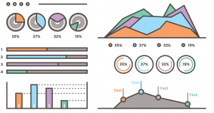
Why DV is a Good Thing
We all consume and process data in different ways. Whilst some of us may find a table of numbers tells a fascinating story (hello all you accountants!), most of us struggle to identify relationships and meaning when data is presented in its raw form. On the other hand, when the data is graphed, and some intuitive colour coding and trend lines are added, patterns quickly become apparent. The rise and rise of infographics is another example.
DV in the Fourth Dimension
Today many organisations have recognised the value of sharing data using DV techniques. Online tools such as Tableau allow the user to add the fourth dimension of time to their charting. Many of their charts include a slider or other tools to reflect changes in data sets over time.
NASA has also used ‘time-lapse’ video very effectively.
Resources and Links
So as you consider how to communicate your message in the most effective way, give DV some consideration. There are no limits. Here are some examples and links.
Stuart McMillen Cartoonist

I met Stuart at a Data Visualisation Meet Up event a few weeks ago. He has approached the topic from a very unique angle, he uses his cartooning skills to share important messages about issues that are important to him, these are ‘hot topics’ such as climate change, racist and procrastination. Visit his website to see his amazing work and learn more about his very honest personal insights and ideas.
The 5 Most Influential Data Visualizations of All Time
A great whitepaper from Tableau that introduces some pivotal DV examples across history.
12th Level
![]()
I have worked with Andrew Cleary at 12th Level Pty Ltd and watched his business transform to become one of Australia’s most capable data analysis and data visualisation specialists.
Vecteezy
Vecteezy is similar to a clip art library where you can access vector files, key building blocks for your infographics. Some are free, others can be purchased.